Pricing Table

The Pricing Table is a standalone component that can be used on your marketing site or other public-facing pages. The Pricing Table will load your configured plans each time it renders, so it will stay up to date automatically without any additional configuration.

Beyond this documentation, the Pricing Table source can be found here

Functional Options

The Pricing Table supports customizing the behavior of the CTAs it provides. The following properties can be set on the PricingTable component itself (example below).

OptionDescriptionDefaultNotes
callToActionUrlURL for plans without a CTA defined in the Catalog.undefinedA predefined CTA for a plan can be done in the Catalog, but is uncommon. If this is unset, no CTA buttons will be displayed.
onCallToActionCallback function to execute when a CTA is clickedundefinedIf callToActionUrl isn’t set, this field will have no effect
1<PricingTable
2 callToActionUrl="/contact-sales"
3 onCallToAction={() => {
4 window.location.href = "/contact-sales";
5 }}
6/>

Styling Options for the Pricing Table

Below are the options that can be set on the Pricing Table to control its functionality. These settings should all be set on the PricingTable component itself (example below).

1<EmbedProvider>
2 <PricingTable
3 showPeriodToggle={true}
4 showDiscount={true}
5 header={{
6 isVisible: true,
7 fontStyle: "heading3",
8 }}
9 />
10</EmbedProvider>
OptionDescriptionDefaultNotes
showPeriodToggleShow toggle between monthly/annual pricingtrue
showDiscountDisplay discount amount for annual planstrue
header.isVisibleShow the pricing table headertrue
header.fontStyleFont styling for the headerheading3Can be any FontStyle option
plans.isVisibleShow the plans sectiontrueHeader text that says “Plans”
plans.name.fontStyleFont styling for plan namesheading2Can be any FontStyle option
plans.description.isVisibleShow plan descriptionstrue
plans.description.fontStyleFont styling for plan descriptionstextCan be any FontStyle option
plans.showInclusionTextShow “What’s included” texttrue
plans.showFeatureIconsShow icons next to featurestrue
plans.showEntitlementsShow feature entitlements/limitstrue
addOns.isVisibleShow the add-ons sectiontrue
addOns.showDescriptionShow add-on descriptionstrue
addOns.showFeatureIconsShow icons next to add-on featurestrue
addOns.showEntitlementsShow add-on entitlements/limitstrue
upgrade.isVisibleShow upgrade buttonstrue
upgrade.buttonSizeSize of upgrade buttonsmdOptions: sm, md, lg
upgrade.buttonStyleStyle of upgrade buttonsprimaryOptions: primary, secondary
downgrade.isVisibleShow downgrade buttonstrue
downgrade.buttonSizeSize of downgrade buttonsmdOptions: sm, md, lg
downgrade.buttonStyleStyle of downgrade buttonssecondaryOptions: primary, secondary

General Styling Options

These are the general styling options that will affect the entire pricing table and all subcomponents. All of these options should be set on a theme object. Example:

1<EmbedProvider
2 settings={{
3 theme: {
4 numberOfColumns: 2,
5 sectionLayout: "merged",
6 colorMode: "light",
7 ...
8 }
9 }}
10>
11 <PricingTable />
12</EmbedProvider>
OptionDescriptionDefaultNotes
numberOfColumnsNumber of columns to display2Options: 1, 2, 3
sectionLayoutLayout of the pricing tablemergedOptions: merged, separated
colorModeColor mode of the pricing tablelightOptions: light, dark
primarycolor of any element that is the primary color#000000Typically this is for buttons, links, and other interactive elements
secondarySecondary color of the pricing table#194BFBTypically this is for the background color of the pricing table
dangerDanger color of the pricing table#D75A5CTypically this is for error messages
card.backgroundBackground color of any card element#FFFFFFEach plan is a card element
card.borderRadiusBorder radius of any card element10Each plan is a card element
card.hasShadowWhether any card element has a shadowtrueEach plan is a card element
card.paddingPadding of any card element45Each plan is a card element

Typography Options

Additionally, all of the typography options are configurable. The any text element can have its typography set to any of the following FontStyle options:

  • heading1
  • heading2
  • heading3
  • heading4
  • heading5
  • heading6
  • text
  • link

These are also configured on the theme object. Example:

1<EmbedProvider
2 settings={{
3 theme: {
4 typography: {
5 heading1: {
6 fontFamily: "Manrope",
7 fontSize: 37,
8 fontWeight: 800,
9 color: "#000000",
10 },
11 ...
12 }
13 }
14 }}
15/>

Each of these can be configured as follows:

OptionDescriptionDefaultNotes
typography.heading1.fontFamilyFont family for any FontStyle of heading1”Manrope”
typography.heading1.fontSizeFont size for any FontStyle of heading137
typography.heading1.fontWeightFont weight for any FontStyle of heading1800
typography.heading1.colorColor for any FontStyle of heading1”#000000”
typography.heading2.fontFamilyFont family for any FontStyle of heading2”Manrope”
typography.heading2.fontSizeFont size for any FontStyle of heading229
typography.heading2.fontWeightFont weight for any FontStyle of heading2800
typography.heading2.colorColor for any FontStyle of heading2”#000000”
typography.heading3.fontFamilyFont family for any FontStyle of heading3”Manrope”
typography.heading3.fontSizeFont size for any FontStyle of heading320
typography.heading3.fontWeightFont weight for any FontStyle of heading3600
typography.heading3.colorColor for any FontStyle of heading3”#000000”
typography.heading4.fontFamilyFont family for any FontStyle of heading4”Manrope”
typography.heading4.fontSizeFont size for any FontStyle of heading418
typography.heading4.fontWeightFont weight for any FontStyle of heading4800
typography.heading4.colorColor for any FontStyle of heading4”#000000”
typography.heading5.fontFamilyFont family for any FontStyle of heading5”Public Sans”
typography.heading5.fontSizeFont size for any FontStyle of heading517
typography.heading5.fontWeightFont weight for any FontStyle of heading5500
typography.heading5.colorColor for any FontStyle of heading5”#000000”
typography.heading6.fontFamilyFont family for any FontStyle of heading6”Public Sans”
typography.heading6.fontSizeFont size for any FontStyle of heading614
typography.heading6.fontWeightFont weight for any FontStyle of heading6400
typography.heading6.colorColor for any FontStyle of heading6”#8A8A8A”
typography.text.fontFamilyFont family for any FontStyle of text”Public Sans”
typography.text.fontSizeFont size for any FontStyle of text16
typography.text.fontWeightFont weight for any FontStyle of text400
typography.text.colorColor for any FontStyle of text”#000000”
typography.link.fontFamilyFont family for any FontStyle of link”Inter”
typography.link.fontSizeFont size for any FontStyle of link16
typography.link.fontWeightFont weight for any FontStyle of link400
typography.link.colorColor for any FontStyle of link”#194BFB”

Pricing Table Example

An example of a standalone component in use is the Pricing Table component from the Schematic Weather Demo App

Standalone Pricing Table

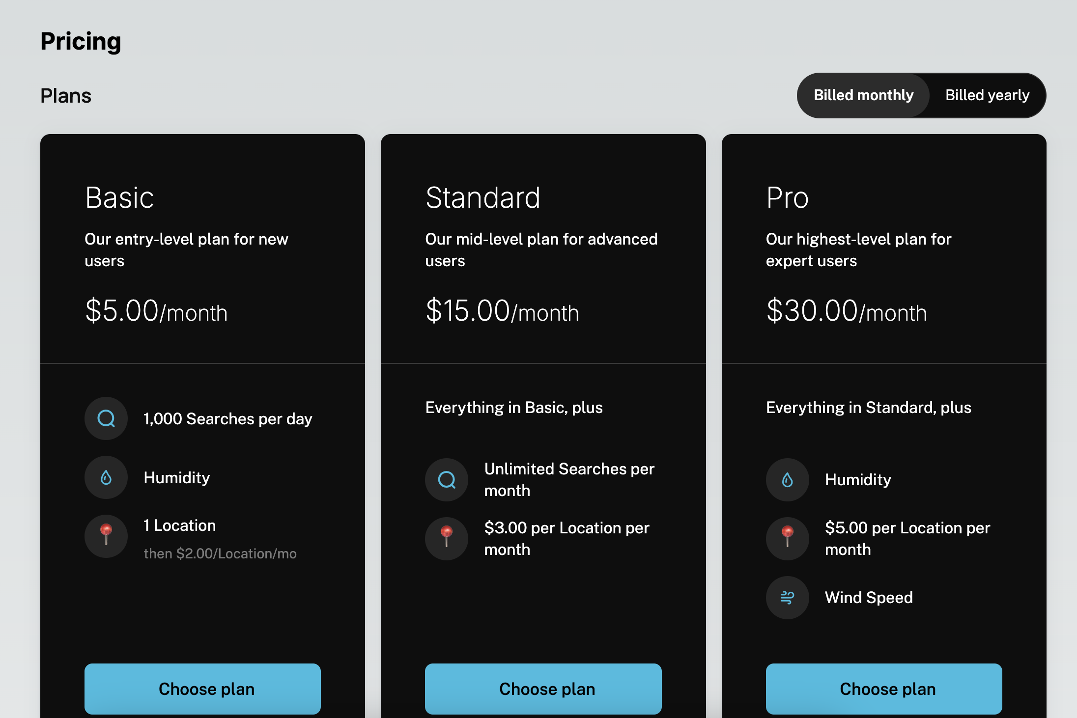
That pricing table is reproduced below (or see it on GitHub]):

1"use client";
2
3import { EmbedProvider, PricingTable } from "@schematichq/schematic-components";
4
5export default function Pricing() {
6 const apiKey = process.env.NEXT_PUBLIC_SCHEMATIC_PUBLISHABLE_KEY;
7
8 return (
9 <EmbedProvider
10 apiKey={apiKey}
11 settings={{
12 theme: {
13 numberOfColumns: 2,
14 sectionLayout: "merged",
15 colorMode: "light",
16 primary: "#2bbde1",
17 secondary: "#2bbde1",
18 card: {
19 background: "#0e0e0e",
20 borderRadius: 10,
21 hasShadow: true,
22 padding: 45,
23 },
24 typography: {
25 heading1: {
26 fontFamily: "Inter",
27 fontSize: 37,
28 fontWeight: 400,
29 color: "#ffffff",
30 },
31 heading2: {
32 fontFamily: "Inter",
33 fontSize: 29,
34 fontWeight: 200,
35 color: "#ffffff",
36 },
37 heading3: {
38 fontFamily: "Manrope",
39 fontSize: 20,
40 fontWeight: 600,
41 color: "#ffffff",
42 },
43 heading4: {
44 fontFamily: "Manrope",
45 fontSize: 18,
46 fontWeight: 800,
47 color: "#ffffff",
48 },
49 heading5: {
50 fontFamily: "Public Sans",
51 fontSize: 17,
52 fontWeight: 500,
53 color: "#ffffff",
54 },
55 heading6: {
56 fontFamily: "Public Sans",
57 fontSize: 14,
58 fontWeight: 400,
59 color: "#d1d1d1",
60 },
61 text: {
62 fontFamily: "Public Sans",
63 fontSize: 16,
64 fontWeight: 400,
65 color: "#ffffff",
66 },
67 link: {
68 fontFamily: "Inter",
69 fontSize: 16,
70 fontWeight: 400,
71 color: "#2bbde1",
72 },
73 },
74 },
75 badge: { alignment: "start", visibility: "visible" },
76 }}
77 >
78 <h1 className="text-2xl font-bold mb-4">Pricing</h1>
79 <PricingTable callToActionUrl="/usage" />
80 </EmbedProvider>
81 );
82}